Visualization
The centerpiece chart, and how to read it.
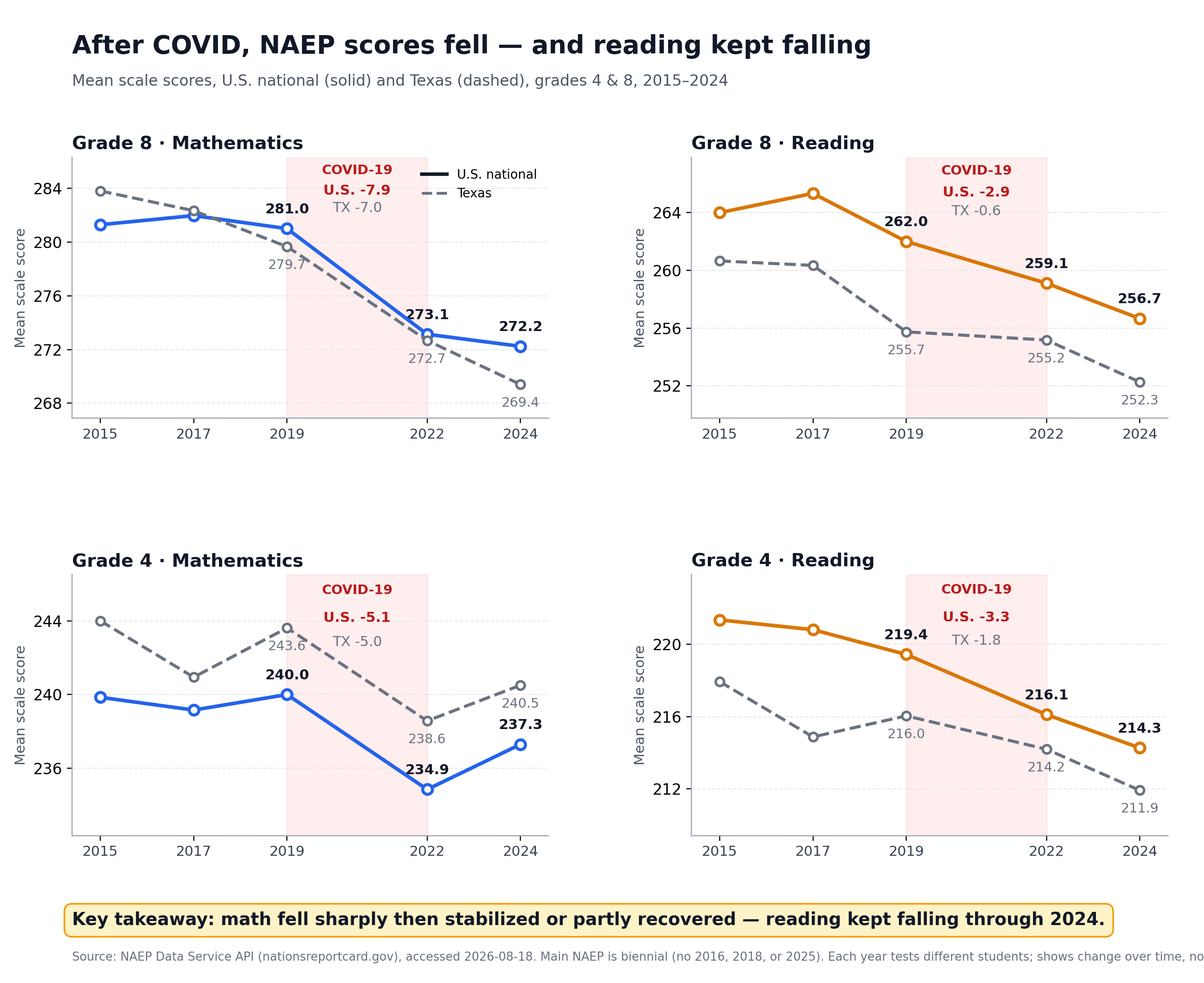
How to read it
Each of the four panels is one subject and grade. The solid line is the U.S. national average; the dashed line is Texas. The shaded band marks the pandemic gap between the 2019 and 2022 assessments. The labels inside the band show how far each line fell during those years.
The key takeaway
Mathematics fell sharply and then stabilized or recovered; reading fell and kept falling. The two subjects moved in different directions after the initial shock — and that difference is the single most important thing this project found.
What the visual does not show
The chart shows change over time, not cause. It does not show why reading kept falling, and it does not show anything about individual students or schools — NAEP samples different students each cycle and reports only group averages. The full limitations are in the limitations section.
Data source: NAEP Data Service API (nationsreportcard.gov), accessed August 18, 2026.